Friday, June 30, 2017

Decision Review 03: Outdoor & Other things

We lived in our beautiful house for more than 6 months now and it has been pretty amazing (apart from the trouble of long commute to work)! I started this decision review series to reveal what we would do differently if we are to build again and what are the 'standard' things we are happy with, hence do not regret upgrading!

Bricks: Our Bricks were a less expensive upgrade to 'Urban One Pepper'. Another brick we considered was 'Everyday Freedom'. Compared to Freedom, Pepper had a much nicer texture and the cost of the upgrade was justified. So, absolutely happy with the Pepper Brick so far and quality of brickwork.

Urban One Pepper
Design: I have checked floor plans of lots of houses before and I still do, but 'Cordova Two' ticks out all the boxes we want to see in our house:

  • Master-bed NOT at the front of the house
  • A Walk-in-Robe with Mastersuite
  • The theater room is next to the main living area, not near the entrance so that it can be used as an extended living area
  • Butlers Pantry option and the size of the pantry
  • Lots of windows to ensure natural light (only dark places are Pantry, WIR and Hallway)
  • One side of the house has no doors (the bedroom side) so we could leave minimum gap while placing the house on the block
  • Dining Area is closer to Kitchen (i.e. sitting area has some distance from Kitchen Benchtop)
  • The front of the house facing South (the worst side) which has garage and one spare bedroom only
  • The Alfresco facing North-West ensure natural light all year around
  • Living areas on the west, so it has natural light when we are using them
  • Bedrooms in the east, so in summer they are not too warm to take rest in the evening
  • Windows with Kitchen to allow better ventilation
  • No sunlight in the pantry to keep food items naturally cooler
If we are to build again in a similar sized block, I am sure other designs will have hard time impressing me :)

Facade: This was our first build and we built on a budget. So, we didn't give much thought on upgrading the facade. And sometimes I regret this. If we build again, even if I will not entirely upgrade the facade, I would prefer some minor modifications to it. Here are these:

  • Remove the Left side Brick Pillar entirely
  • Will complete the front patio pillar with brick removing the half-size post
  • Change the two double hung windows of front bedroom to a single but wider one
  • May not go for Bag & Paint at all with the above changes
  • May have selected ColourBond Terrain Garage door or Caoba-stained one
  • Instead of ColourBond Basalt, we would have gone with Monument (slightly darker than Basalt)


Most of the above changes to the facade would have cost a fraction of actual Facade upgrade and some of them would have been done for free (I know someone managed this).

Landscaping: On the side of the house, we went with pebble & step stones, and it looks good. However on the side of the garage, we need to install pavers so that we can keep the bins behind the gate. Dragging heavy bins over pebbles is not an option so had to keep the red bin at the front, which we don't like at all!. Pavers seem to be cheaper option to fix the issue compared to concreting.

Wednesday, March 29, 2017

Decision Review 02: Living & Kitchen

It had been nearly 4 months in our house and 2 months since I last posted anything! Time for decision review session 2!

I am gonna talk about Living areas this time.

Ceiling Height: We opted for 2550 cm ceilings upgrade. Though unplanned, this ceiling height somehow had given an uniformed look with the window height, recess height and the door heights. I like this height similarity, thank God we didn't go for any higher ceilings, otherwise we wouldn't have known that we needed to increase the heights of windows and doors also to match with 2700 cm ceiling.

Air con: We didn't upgrade the aircon that was included in the package with standard two-zone system. So far it had passed the test for both Heating and Cooling mode over the last months! And even though we used it a lot, the electricity bill is NOT crazy as we expected!

Shelving: Our standard inclusion for shelving was ventilated wired shelving, so we had to upgrade it to melamine shelving. I don't think we could live without this upgrade. for a 1,700 or something for the house throughout, it was a must have.

Kitchen: As I shared earlier, we were quite firm on our decision that unless an upgrade adds additional functionality, we won't be upgrading it. So, we chose everything for kitchen from the standard range which is Matt finish. Here is how it looks:

If you are after a white kitchen, you may think to upgrade to Sheen finish.

Also we didn't upgrade the benchtop, which is Caesarstone Linen, no thickness increase, no waterfall edges. No regrets at all. Exteremely happy with the Linen, it doesn't reveal watermarks easily like the other one we have in our ensuite (Caesarstone Walnut). If you are after low maintenance, Linen is a great choice if it goes with your colour scheme.

Even though we had option, we didn't go for under-mount sink (I know it is very stylish but we love the extra space on the side of our sink). I have seen few of our friends having this under-mount sink, and they kept the washed pans etc inside the other portion of the sink for water drain out! We really didn't want to do that.

Also went with fixed cooker (separate burner and oven) as opposed to free-standing one. The reason being we cook spicy-oily food a lot and cleaning the sides of free standing oven would be painful. Happy with other Fisher & Paykel appliances (Fridge, Dish washer, Washing Machine, Dryer) as well.

Now on the downside, the position of the fixed microwave is not ideal, you have to bend while operating it and it is not AT ALL safe if you have kids. And the switch to turn off the oven is AT THE BACK OF THE Microwave, so you can't easily switch the power off when the device is not in use!! If we could've predicted this earlier, we would've changed this space into a drawer or something, as we had to use a separate microwave set up on the back bench-top anyway. Another option is a Tower-style which can't fit in our tiny kitchen.

Butlers pantry: On the positive side, you have the extra hidden sink which becomes very useful specially when you have guests. But it surely takes out some space for your shelves.


Power Points: In Kitchen, we added 3 double power points (2 on back-bench) and 1 on the side of the island: very useful indeed. Another one is in Butlers Pantry. We have power-points in nearly every corner of the living areas. Decision for placing a Floor lamp or a power connection while doing vacuum becomes easy because of them.

Laundry: Cordova Two has a 'linen' inside the laundry already. So, we didn't add any extra storage space in laundry. And I couldn't agree on using a front-load washer, so couldn't extend the laundry top. No issues so far, with all the the built-ins in the house, additional storage is not required for us at the moment.

Here are some pictures:


Cordova Two: HT which became MISC room with Musical instruments, Books


Tuesday, January 24, 2017

Decision Review 01: Bedrooms & Bathrooms

Two months back on this very day we received the keys of our dream home and we moved in a week after. For a while, I was planning to write a 'Decision Review' series based on our experience after living in the house for nearly two months. This post is to say, if we are to go back and make all the choices again, what we would do differently, what are the standard features/upgrades we are happy about, what are the things we are facing problems with.

Note: this is solely based on personal experience and financial limitation.

Let's start with Master-suite: from structural point-of-view our master-suite is fine the way it is. But if we could do electrical appointment again, we would change two things!

  • First one is adding a dimmer to the downlight. We have total four downlights, and they are sometimes too bright. Would have been great if there was a dimmer (yeah, it can be added now by an electrician). For rest of the bedrooms, we have two downlights per room, and pretty happy with the output. 
  • The second thing would be to add one pre-wiring for wall light so that we could add two wall lights on two sides of the bed head. In case you are wondering why I can't just be happy with two bed side lamps, let me tell you, I have twin toddlers who try to disassemble lamps by taking bulbs etc out pretty often!!


Walk-in-Robe: The only upgrade we did in Master suite is adding a 'sliding' door instead of standard 'swing' door to the walk-in-robe. And this is one of the changes we are super happy about. it is so convenient and saves so much space. As I can recall, it was around 650$ or so. We also have two 4DM units installed in WIR, we found these units, assembled and installed for under 350, were quite reasonably priced. We use this space also for getting ready (particularly helpful when one of us is still sleeping and wouldn't want to be disturbed). We have full-length mirror installed (so helpful for dress trial ;)). And the double power point inside the WIR ensures we can do a quick iron or use a fan while getting ready if required.

Bedrooms: In bedrooms, we changed the swing doors to built-ins to Mirror sliding doors and added a 4DM unit inside each of the built-ins. Again the sliding doors saves space compared to swing doors, the mirror enlarges the room and also brightens it up. In Bed 3, we originally had two awning windows, which we changed to double-hung windows for around 350 each. I am personally not a big fan of awning windows mainly because of the ventilation issues. Glad that we could predict it at planning phase.

Now Ensuite: Our ensuite has the minimum upgrade which is adding a glass shelf in the shower. We didn't add a shampoo recess here because the inner walls need extra thickness before adding a recess which was estimated around 400$. We had to opt for a cheaper alternative of glass shelf costing under 100$. We can still put the light-weight items like face-wash, scrub etc on the glass shelf, but for heavier things like 2L shampoo or shower gel bottles, we had to put them separately in a floor shelf.
Again, we don't regret this.
Ensuite is the one place we have the only awning window of the house, I mentioned above, not very happy about the ventilation it provides! However, we are okay with standard white shower screen, the semi-frame-less one would have looked better though.

At our electrical appointment, we planned to install the fan-light-heater combo to bathrooms after handover. However, it was quoted higher than MJH by electricians, so we haven't installed it yet. But if we are allowed to go back at our Electrical appointment, we would do this with MJH for both bathrooms.

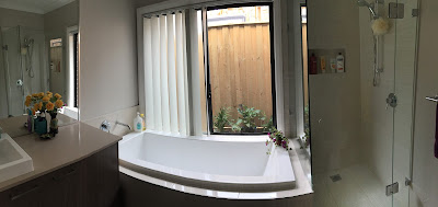
Main Bathroom: Now, we are facing few issues in the main bathroom, mostly related to bathtub placement. Main bathroom has the vanity next to the bathtub. When my darling daughters play 'splash splash' during their bath time, I have to put a temporary cover on the side of the vanity so that it won't get wet. However, nothing can be done to the wooden window architraves next to the tub. Even though we dry it up straight away, this is an inconvenience indeed. We had to upgrade to Frame-less shower (which was too expensive) for a reason, but now we are happy with how it looks in the already congested main bathroom.


We didn't upgrade the shower head on purpose on any bathrooms, after a shower it is very easy to take it out and give the shower screen a quick wash. We did add a shampoo recess in the shower, but unfortunately its height is not enough for taller bottles, whoa!!
Now, we didn't go for floor to ceiling tiling, it is good if you can afford it, so far we don't regret it. Also, we didn't add the any drawers to vanity considering it doesn't add extra storage. We don't regret this either. One thing we didn't know while doing our colours appointment, to install a bigger mirror on the wall next to vanity, otherwise would've at least asked for the price of this upgrade.

Hope this is helpful for people who are making a decision to upgrade things or do stuff after handover. It is not long we were doing the same! Will cover living area and outdoor in another post!


Friday, December 23, 2016

Dining Setting for Alfresco

As the decking of Alfresco is complete, it's time to think about some sitting arrangements. Ordered this sleek beauty today: it is called "Excalibur Outdoor living 7-piece folding dining set"


This is of similar shade of our Pepper Brick. Let's see how it will look:


Foldable, can be converted to two-chair-setup, has storage space inside the table for chairs to be stored. Perfect for our small alfresco.

Thursday, December 22, 2016

Backyard: Decking & Garden Screen

Landscaping at the backyard is nearly finished. This week, our landscaper has worked on decking mainly. We are extending the alfresco by 4.5sqm making it around 17sqm. We went for composite decking material because it is of low maintenance. The colour is called Red Rock.

Also an L-shaped garden screen has been installed today to hide Rain Water Tank and Aircon. As vining plant, Jasmine has been planted. In a year or two, the garden screen should be like a green wall of Jasmine.

Here are some photos:

Cordova Two: Deck extension under Eaves

Removable Drainage cover

Deck & Garden Screen

Jasmine as vine


Cordova Two Alfresco

And a photo showing my favorite before & after effect:
Landscaping (before & after)

The composite decking material wasn't used for the sides of the deck, treated pine has been used, now we have to paint it to a suitable colour. The alfresco feels much bigger now. Unfortunately, the only pending thing by our landscaper is the patio tiling, which got moved to first week of January. 

Friday, December 16, 2016

Landscaping at the Front

Front-yard had been dressed up this week. Letter box had been done, tress & shrubs had been planted, turf had been laid. Here are some photos:

Cordova Two: Classic Facade

Cordova Two: Classic Facade


The before and after effect:
Cordova Two McDonald Jones


Monday, December 12, 2016

Security Screen, Brick Edging etc

There hasn't been much progress since the driveway had been poured last Wednesday. On Thursday and Friday, landscaper was on site only for few hours. They have done some land leveling of the front-yard along with brick edging. Not happy with the speed of landscaping. There is only one more week left before Christmas, we want it all done before everyone goes on holiday mode!

One necessary thing, that has been done over the weekend, is the security screen installation for the front door and diamond screen mesh installation to two front windows. Our toddlers were trying to go out if the main door wasn't deadlocked with a key (yes, they can open the locked door already). So, relieved that we have another layer of protection now and the door handle of screen door is out of their reach!

For specifics on the security screens, we used Prowler Proof Protec. Diamond mesh color for front windows is Monument (same as our window frame). As our front door is painted in Taubmans 'Mountain Wine', Claret from Prowler Proof was the closest match when we checked against the color sample. At day time from inside, we can see outside as if there is nothing on the door, but from outside it doesn't show much unless you're very close to the door.

Few photos after Brick edging for the Garden bed is done and security screens have been innstalled:


Cordova Two: Classic Facade

Prowler Proof Protec in Claret color